Evaluation
1. In what ways does your media product use, develop or challenge forms and conventions of real media products?
Our media products use, develop and challenge forms and conventions of real media products. We used mainstream conventions in our products such as a dark narrative and a female victim. We have also challenged conventions of real media including things such as having a female perpetrator based of off the idea of mental health and how it can effect someones state of mind. The video below presents in further detail of how our media products use, develop and challenges forms of real media products...
|
Final Changes
We developed our magazine cover further by separating the background from the image and changing the lighting on the image of the actor Luka Shaxson. Developing conventions of real media products for our magazine is important as if our magazine didn't look professional and if it didn't meet our audience's expectations it would put our target audience members off wanting to read our magazine. Furthermore we developed conventions of real media products for our poster also by adding a hashtag and our production company logo at the bottom; this could help our products become more recognised, attracting our audience more. |
|
|
|
This video shows our stages of development with our final changes on our magazine cover, the video shows mine and my partner's development on our skills that we have gained from using 'Final Cut Pro'. Due to our experimenting and discovery through research we gained many skills of how to use 'Final Cut Pro' in more advanced ways, here you will see us working together to achieve our aim in separating the image from the background to continue our success on developing our conventions on our magazine cover.
|
Conventions of Real Media Products that inspired us...
|
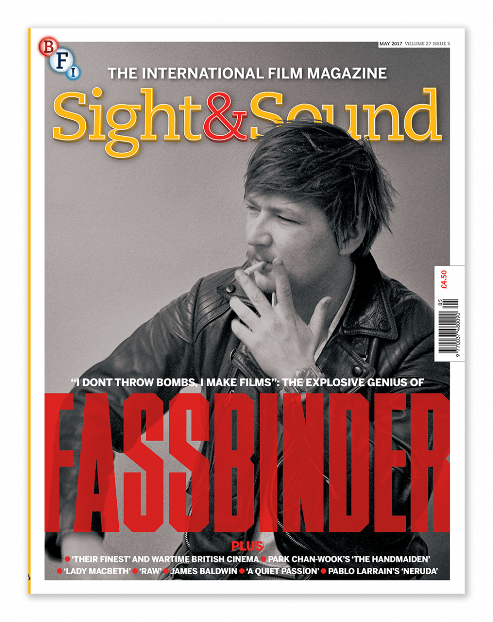
As you can see this 'Sight and Sound' magazine uses a plain, dark background, furthermore the main actor has clearly been separated from the original background and although he is wearing darker clothes the lighting on him is still bright enough for him to be seen clearly; and due to this he really stands out and isn't lost with the rest of the picture. The use of the background being a darker and grey colour really allows everything that is important to stand out, including the picture and the text. This is why we decided to make the final changes of separating our image from our black background- we still kept the black colour, so that like this magazine the text and image of Luka would stand out. Developing on conventions of real media products in our magazine really helped our image become 'eye-catching' to the viewers. |
|
2. How effective is the combination of your main product and ancillary texts?
|
FINAL 'Incrimination' Poster

|
FINAL 'Incrimination' Magazine

|
FINAL 'Incrimination' Trailer
The combination of our three products:
Same Character and make-up used throughout the three products...

|

|

|
Here we have used the same character throughout and have used the same makeup on her throughout our three products as if we had changed the character and if we had changed the make-up on her drastically then it may have have caused the audience to become confused about who the main character is and what as a person she is like as the way someone looks can say a lot about them and if we changed her make-up her personality and traits may have been crossed over and the audience may become confused and feel disconnected to her character as they would have been shown different representations of her character.
Same Titles used throughout the three products...

|

|

|
We used the same title throughout our three products using the same font and colour, we did this so that the three individual products could be recognised for promoting the same film. If they had been different throughout this may confuse the audience of whether they are promoting the same film, not using the same title may also change the audience's view on what the film is like; this is because we chose this specific font and colour as it is quite sharp which represents the harsh narrative of the film and the use of red highlights the alarming story line and messages shown throughout. So to use a different title for one of the products and not the other could create the wrong atmosphere and tone we want to create for our viewers.
Similar Language used throughout the three products...

|

|

|
We used the same language throughout the three products, we used formal and personal language, we did this because we wanted our product to look professional and we wanted our viewers to want to read about it and go and see it. The personal language used throughout meant that there was a larger impact on the audience as it was more relatable and they are being asked a personal question and the professional and realistic language is a convention of real media texts and so this would to interesting to the audience and they would appeal to it.
Similar Colour Scheme and theme used throughout the three products...

|

|

|
We used a similar colour scheme throughout the three products as it created great synergy between all of them and it made it clear that they were all promoting the same film, it also created a sense of doom which represents the overall film. The use of the similar colours also built on the idea of the character, in particular, Alice as it created a dark tone on her face foreshadowing her danger in the film.
The video below explains how effective the combination of our main product and ancillary texts are:
Real Media text's combination of products that inspired us...
|
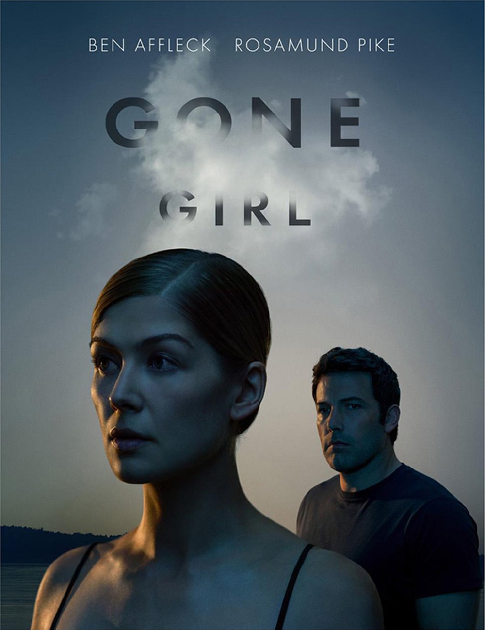
'Gone Girl' Poster
|
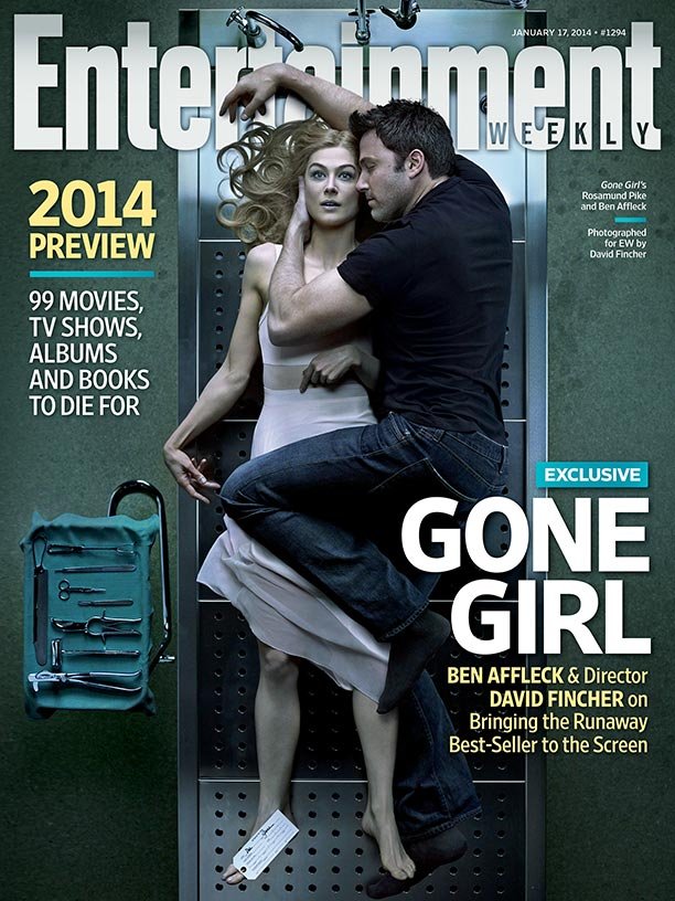
'Gone Girl' Magazine Cover
|
'Gone Girl' Trailer
'Gone Girl' was a real media text we looked at and were inspired by when researching real media texts, there is a great use of synergy between the three products: poster, magazine and trailer. Similar text is used throughout- the exact same font for the title is used in the poster and trailer, and similar text is used on the magazine cover, this being large, bold writing which is very 'eye-catching' and on the poster and in the trailer mist is used around the title to create a 'spooky' atmosphere. The use of similar text throughout the three products clearly portrays they are promoting the same film. Furthermore there is a similar use of colours used, mainly being blue, black and white, these are quite dark colours and overall represents the dark nature of the film, these three colours are used throughout the three products conveying the same theme and tone. Continually all three products show the same main characters throughout, (Amy and Nick)- the use of the same characters and similar clothing and make- up used throughout helps the products be recognised together as the same film and this also allows the audience to develop their understanding on the couples relationship.
3. What have you learned from your audience feedback?
All this feedback was very important as the members of our target audience that we asked pointed things out that we might not have realised because we may have been so immersed in the project. We believed the most useful of all our techniques of gathering feedback was probably using Snapchat and also filming people's reactions to our products. The reason we thought these were the best ways of gathering feedback was due to the most useful responses from using both these techniques; the use of Snapchat meant we were targeting our target audience (17-25 years) as Snapchat is known for being popular amongst young adults, Snapchat is also used all over the country so we were able to get responses from people from ages of 17-25 years all over Britain, this meant we got many responses which was good as the more we had the bigger of an idea we had of how to appeal to our target audience and therefore we were more likely to produce a success product. Furthermore we thought that recording people's reactions to our products was also one of the most successful techniques as by watching our audience's reactions gave a really good idea of how they were reacting to them, meaning we could look at that their natural responses and see if we were meeting our target of making the audience engaged in the trailer and if they were reacting the way we wanted them to at certain clips in the trailer, for example the clip of the character, Millie being bullied, we wanted them to sympathise with her character and have an understanding of her character. From the reaction videos we could clearly see from body language and verbal reactions that for that particular part we were getting the right response we wanted. As for example one audience member's facial expression dropped, showing a sad expression and also let out a sigh of upset and frustration.

|

|
4. How did you use media technologies in the construction and research, planning and evaluation stages?
|
This video is a montage showing only a few of the media technologies we used throughout our portfolio, in our research and planning the most useful media technology was probably the website 'Google' as this gave us so much information when it came to researching how to appeal to our target audience which was very important as if we didn't appeal to our target audience they wouldn't be interested in our film. Furthermore in construction the most useful useful media technology was 'Final Cut Pro' and 'Photoshop' as it had a range of features that allowed us to create great effects on our products t have a bigger impact on the audience. Finally for my evaluation the most useful media technology was YouTube and being able to put videos up of myself as this helped my work become clearer as I was able to express myself verbally.
|
|
 RSS Feed
