Ancillary
Final Poster and Magazine Products:


Task 24- Creating our Film Poster
|
This is a video showing us working on our film posters:
|
Our Film Poster drafts:
|
We thought making drafts together of the ideas we came up with was a much better idea rather than going straight into creating our final film poster as this gave us a variety of ideas, which would mean we would be making sure that our film poster is the best it can be in order to intrigue our audience and also create synergy with our other products to overall present our film in the most professional and effective way.
Inspiration...
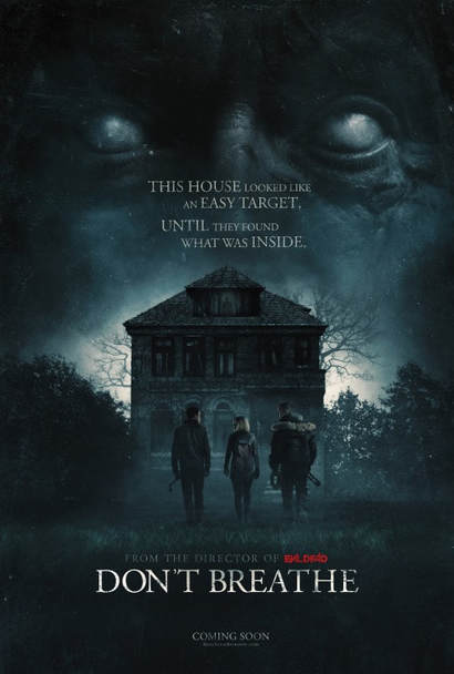
'Don't Breathe' Film Poster:
|
Looking back at our research stages- where we looked at how synergy is created well through film products; we looked at some thriller film posters in order to get a good understanding of how a film poster should look. I looked at the film 'Don't Breathe' (2016) which is a thriller film about 'Rocky (Jane Levy), Alex and Money are three Detroit thieves who get their kicks by breaking into the houses of wealthy people. Money gets word about a blind veteran who won a major cash settlement following the death of his only child. Figuring he's an easy target, the trio invades the man's secluded home in an abandoned neighborhood. Finding themselves trapped inside, the young intruders must fight for their lives after making a shocking discovery about their supposedly helpless victim.' |
|
The 'Don't Breathe' film poster took my interest when researching as I thought the dark colours used really conveyed the thriller genre well, and furthermore I also believed this conveys the dark narrative of the film. The overall poster is very appealing to look at as the iconography used really gives you sense of the overall story, and everything on the poster such as the placing of the characters, the log-line, and the merging of the two images (the three characters and older man above) we were inspired by most and felt this would be most effective if we were to use similar techniques for our poster.
'Gone Girl' Film Poster:

Another film I looked at in the research stages was the film 'Gone Girl' (2014) which is a thriller film about 'In Carthage, Mo., former New York-based writer Nick Dunne (Ben Affleck) and his glamorous wife Amy (Rosamund Pike) present a portrait of a blissful marriage to the public. However, when Amy goes missing on the couple's fifth wedding anniversary, Nick becomes the prime suspect in her disappearance. The resulting police pressure and media frenzy cause the Dunnes' image of a happy union to crumble, leading to tantalizing questions about who Nick and Amy truly are.'
Another film I looked at in the research stages was the film 'Gone Girl' (2014) which is a thriller film about 'In Carthage, Mo., former New York-based writer Nick Dunne (Ben Affleck) and his glamorous wife Amy (Rosamund Pike) present a portrait of a blissful marriage to the public. However, when Amy goes missing on the couple's fifth wedding anniversary, Nick becomes the prime suspect in her disappearance. The resulting police pressure and media frenzy cause the Dunnes' image of a happy union to crumble, leading to tantalizing questions about who Nick and Amy truly are.'
The 'Gone Girl' film poster took my interest when researching as the characters really intrigued me, you are straight away shown who the main characters, and although compared to the 'Don't Breathe' poster it doesn't look as 'busy' with the amount of effects and images used it still creates a mysterious atmosphere due to this. This poster clearly shows its main focus is on the characters- meaning it is very character based. This made us think about how the characters really need to connect with our audience and this may make the audience become more invested within our film.
|
|
|
'Split' Film Poster:
|
Another film I looked at in the research stages was the film 'Split' (2016) which is a thriller film about a man 'Kevin (James McAvoy) who has evidenced 23 personalities to his trusted psychiatrist, Dr. Fletcher (Betty Buckley), there remains one still submerged who is set to materialize and dominate all of the others. Compelled to abduct three teenage girls led by the willful, observant Casey, Kevin reaches a war for survival among all of those contained within him -- as well as everyone around him -- as the walls between his compartments shatter.' |

|
The 'Split' poster took my interest mainly due to the effect of the shadow creatures as it is a clever way of highlighting what the character is like and the main purpose of the story and giving a slightly 'spooky' and unnerving atmosphere of the mystery behind how dangerous his character is. Again like the 'Don't Breathe' poster there is a log-line and I believe that this is a very effective way of intriguing an audience but also a clever way of creating synergy between products, as the product will be recognised for the log-line and therefore will be more memorable.
Initial Ideas and shots... |
Me and my partner created our own individual ideas for the poster and then came together and shared our ideas and explained to each other why we used certain features, we both made the decision to come up with the same number of ideas and then compare them, deciding which ones we thought were the best and perhaps which ones we could use together; using a mixture of both our ideas.

|
|
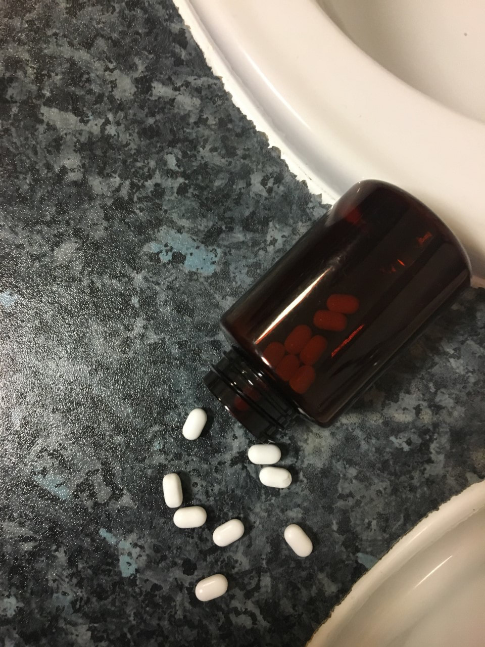
Our idea here was based off of the character, Ella's mental health, the use of the pills portrays the idea of her character and also foreshadows how she is the actual perpetrator. However this may be too obvious and could give away our plot twist, it could also be too confusing for the audience as the pills aren't revealed that much in the trailer and aren't highlighted as the main focus so not only will this create bad synergy between the products but it could also be seen by the audience as too 'far-fetched' from the narration and could make it seem like it is promoting a completely different film product.

|
|
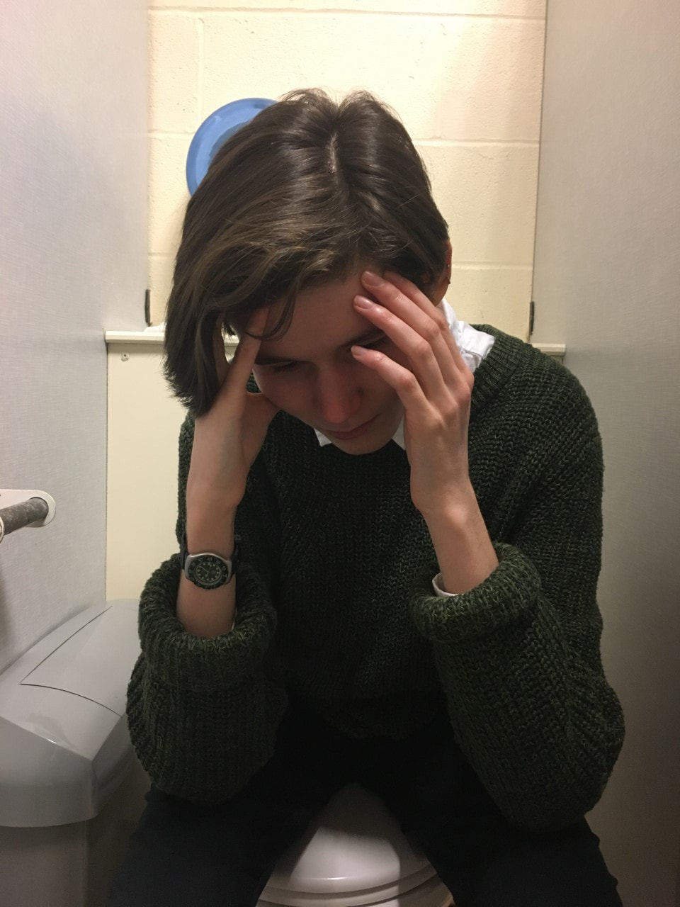
Our idea here was taken from one of the shots we have in our trailer which is of the character Millie who sits in the cubical after being shown to of been bullied by other students, we thought that this would be a good shot to use as it represents Millie's status in the narrative which further suggests why she may have been the one to have abducted Alice due to perhaps her wanting to get revenge from characters which are more fortunate than her (popular). This shot also would make great synergy between the products and it would be clear to the audience that they the poster is promoting the same film as the other products; however we did believe that having Millie as the main focus in the poster may be confusing for the audience and they may misunderstand who has gone missing, and of course we want it to be as clear as possible to the audience of what position each character is in, in the narration.

|

|
Our idea here was to focus on the character Ella as she is one of the main characters and because of her large appearance throughout the trailer and narration the use of her on the poster would make a lot of sense, especially using a close up shot as it conveys her vulnerability which reflects not only the fact her best friend has gone missing but also foreshadowing her unbalanced state of mind and perhaps guilt of her being the actual perpetrator which is revealed at the end of the film narration. However we did believe that only having Ella's character in the poster may be slightly odd as although she is very important to the narration the other characters, Millie and Alice are as well and to only have one of the main characters on the film poster may not be as effective than having all of them.

|
|
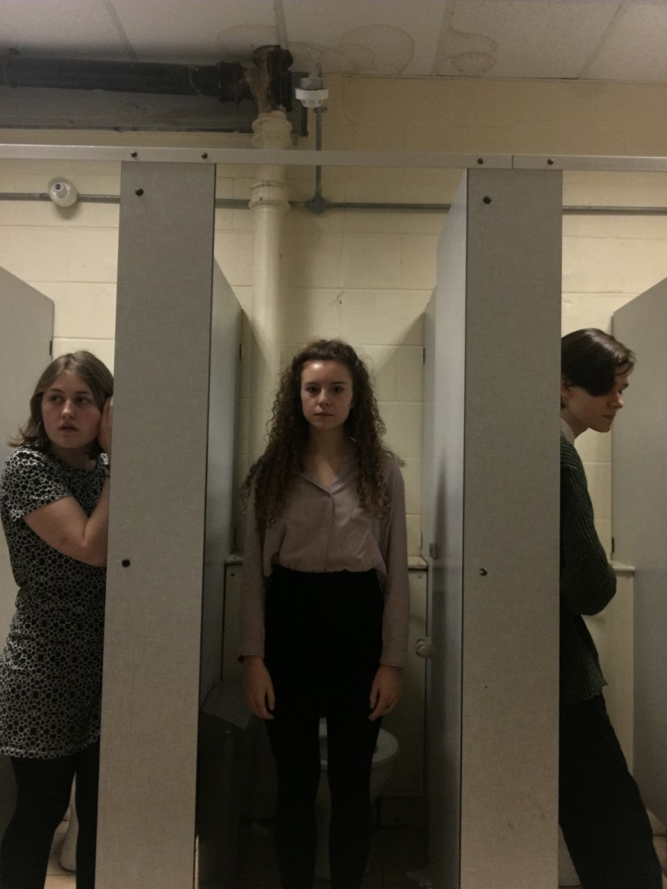
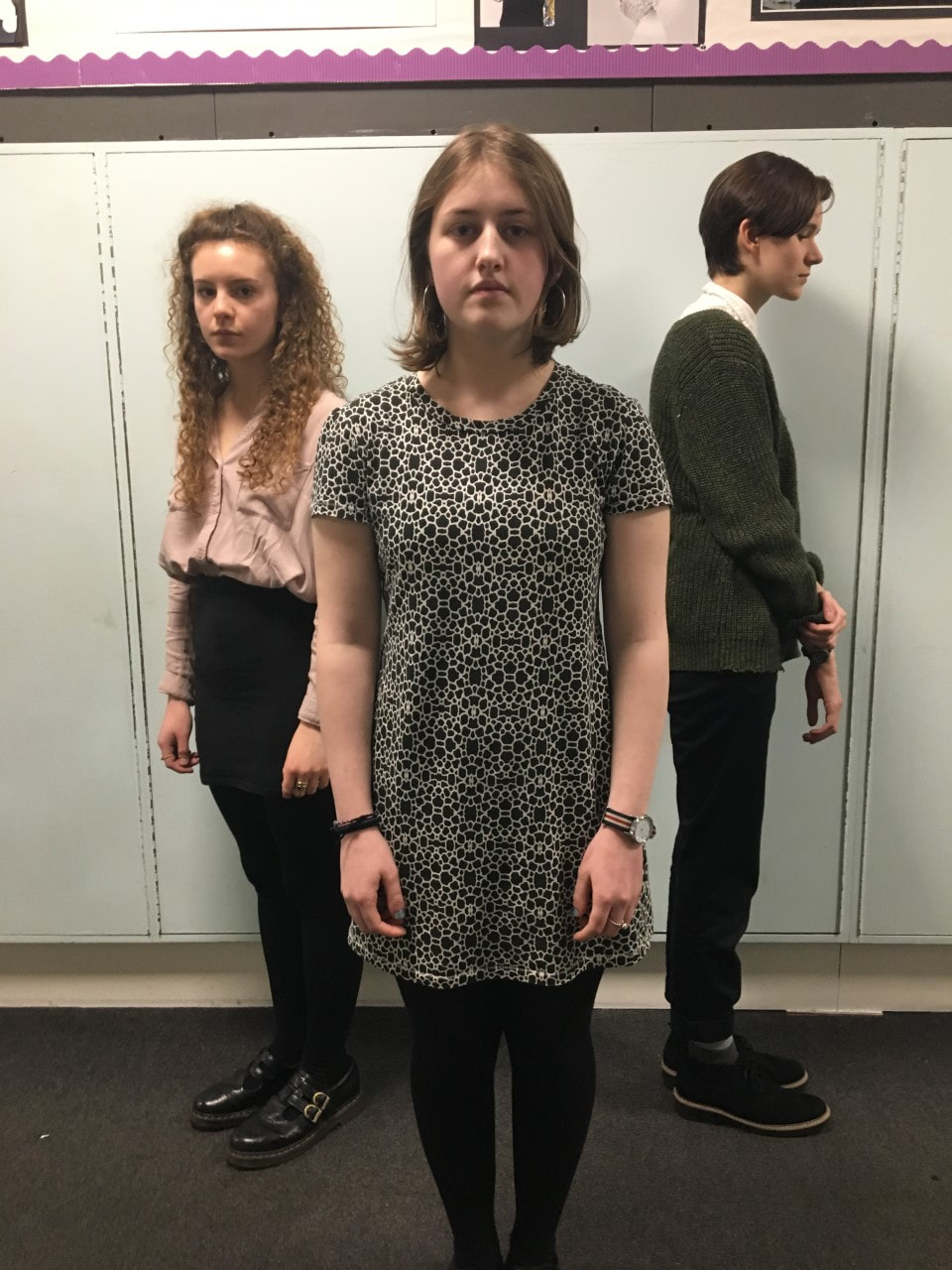
Our idea here was to show each of the main characters and highlight each of their different personalities through the poster so that the audience could connect with them more. We have the character Alice in the middle as she is the focus that drives the narrative and therefore her being the centre of the shot represents her importance in the narration. Furthermore we have Millie's character on the right with her body language showing her slightly hunched over showing her solitude and awkward character, and finally we have Ella's character on the left side; who is listening in highlighting her determined character and her relationship with Alice, which further represents how her character's goal in the narration is to find the perpetrator. At first we believed that this could have been the shot we would use for our final poster decision however we believed that the quality wasn't very professional and that due to the use of placement with characters it would be difficult to place words on the poster and that this would make the poster look too crowded as the words used would most likely be put in the same space on the poster.

|

|
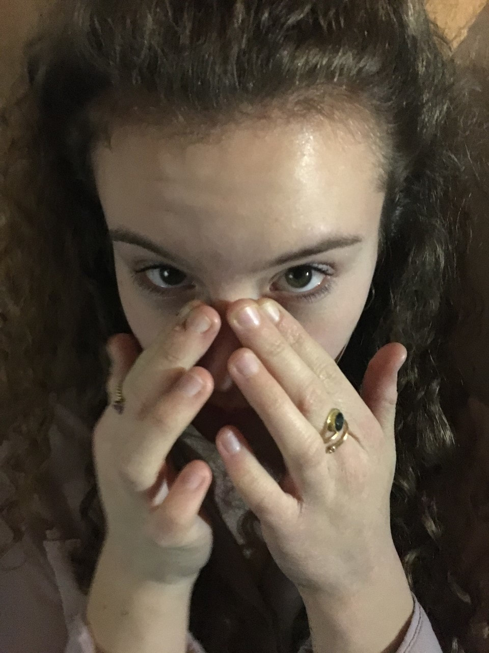
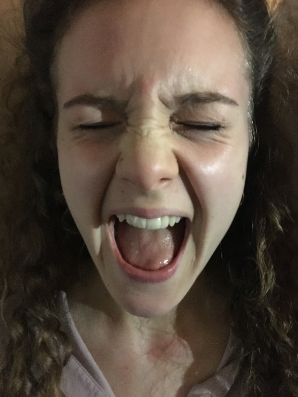
Our idea here is a shot used from the trailer of the character Alice screaming, we thought this would be a great shot to use as it conveys the thriller genre well, shows the audience who the main character is and also links very well to the other products promoting the film as the face of the character will be very easily linked between the products; and overall we thought that it would be very clear for the audience to recognise what the poster is promoting. However we did believe that it still needed something else (perhaps another picture) to go with it in order for it to really stand out.

|

|
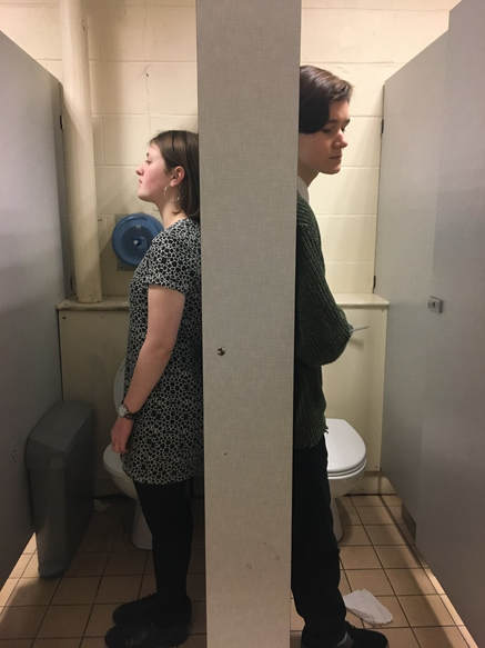
Our idea here was to use one of the most significant locations that is used in the trailer and narration (the bathroom that Alice is suggested to go missing in) with the two main characters back to back showing they are binary opposites due to their disagreements and also suggesting that they are the two main suspects to choose from. We particularly liked this shot and thought it was very effective however we did believe that Alice also should be shown as otherwise it may become confusing for the audience, and we believed it would be wrong of us to not have the main character in the film poster.

|

|
Our idea here was a clever way of promoting the idea of the main character going missing, we thought it would be very 'eye catching' and would link to the main focus of the film well, we also believed it was very unique and a film poster like this had never really been done before. Although we felt confident about this idea the posters in the trailer aren't actually shown that much and so audiences will probably not recognise the poster in relation to the trailer and other products- this meant unfortunately that it really wouldn't work and would probably really confuse our audience.
WE LIMITED OUR IDEAS DOWN TO TWO OF OUR IDEAS WE THOUGHT WERE THE BEST AND WORKED ON BOTH TO SEE WHICH POSTER WOULD BE MOST EFFECTIVE...
Film Poster Idea (1)
When creating this poster I took the shot using a Canon camera, with my partner offering advice on a range of lighting techniques we could use to get a certain 'dingy' and 'spooky' effect with the light reflector. When it came to editing we both made the decision to have the picture in black and white stock and also both came up with the idea to have the same writing and red colouring for the title as we have in our trailer.

|
For our first idea of this poster we thought that changing the colour to darker colours such as black and white would be more effective as it conveys the dark genre and therefore clearly highlighting that it is promoting a thriller film. We especially liked the shot as we thought it looked very professional and represented Ella's character well reflecting her mental health; this also foreshadowing the outcome of the narration that we thought was quite clever to do. We thought the use of the red writing over the black and white effect stood out well- not becoming lost in the background which is good as we want the title to be easy to read and therefore memorable. However we did still believe it may not be clear enough to the audience and we did believe it could be confusing as the trailer doesn't focus on the pills that much. Before adding the essentials such as the billing block and actors names we decided to move on to our next idea as we weren't feeling satisfied with the shot as much as we wanted to be.
|
Film Poster Idea (2)
When creating this poster I was the one to take the shots with a Canon camera and a tripod. My partner had the clever idea of merging the two images, and I worked on the lighting and effects on the images; and together we decided what language and writing would be appropriate to have on it.
With our next idea we decided to use two shots merged together- one of the character Alice screaming and the other of the characters Ella and Millie back to back, we believed using all of the three main characters would be a lot clearer and easier to present to the audience as they would be able to clearly recognise that the poster is promoting the same product.
DEVELOPMENT OF POSTER:
After merging the shots together we really liked the look of it and so decided to carry on editing the poster in order to make it look even better. Down below shows the development after effects and things such as log-lines and titles have been added and what effect over time it gave the poster...

|

|
|
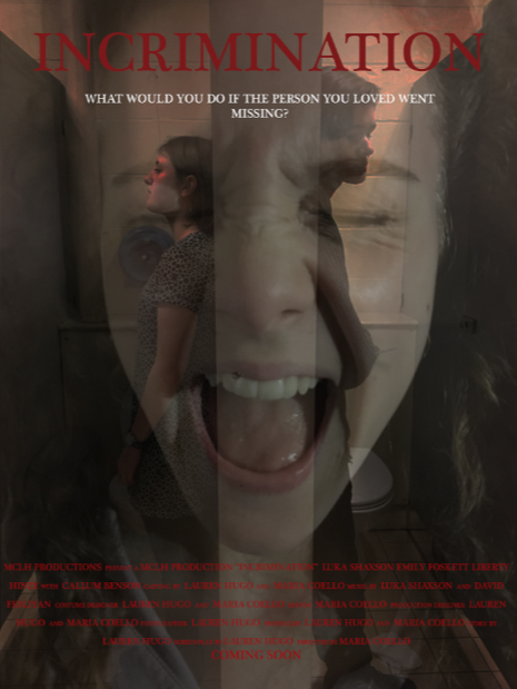
FIRST DRAFT

|
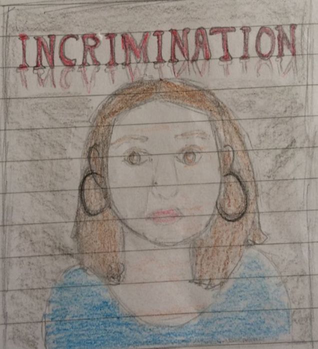
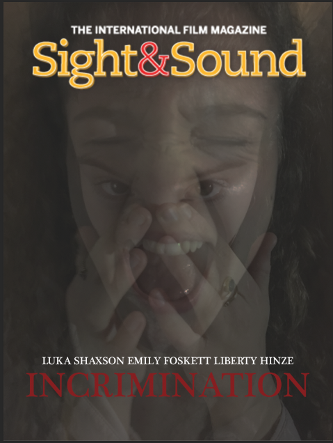
This is our first draft of our film poster that we believe to be quite successful so far in following the conventions of a thriller film poster. First of all using our own unique and original images which perfectly portrays the narrative and the status of the main characters; this introducing the characters in a creative and clear way to the audience. Furthermore we have made sure we have added in essential features such as the actors names as the bottom along with production company logo 'MCLH PRODUCTIONS' and the release date- 'COMING SOON.'
Furthermore we have added in a log-line which we believe will intrigue our audience as it adds a bit of mystery to the film and also is quite a personal question, 'WHAT WOULD YOU DO IF THE PERSON YOU LOVED WENT MISSING?.' The use of this log-line also creates great synergy as the trailer finishes with asking the exact same question to the audience; another feature used to create synergy is the dark effect used which not only makes the lighting darker but also adds a red tint to the poster in the background and on Ella and Millie's faces- this type of dark lighting that gives off a sense of fear is used throughout the trailer and also dark lighting is to be used in the magazine cover to convey a similar atmosphere. |
|
SECOND DRAFT
|
THIRD DRAFT
|
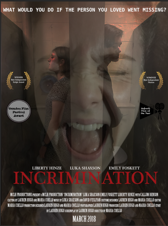
For the development of this poster I made the suggestion that we should have white writing for this poster for the billing block as it was clearer to read, and we both made the decision to add reviews, and we both decided to make the change to the reviews; using real film reviews rather than ones we had created as it would be more realistic and therefore more appealing.
|
Here we have focused on presentation and font, we have changed where the title should go as we believed it looked far too crowded and unprofessional at the top. Another element we decided to change was the writing of the billing board as from research we discovered that the writing at the bottom is in a specific type of writing so to make our poster look authentic and professional we changed the font to the more popular and well known font that is used in mot film posters; we also changed the colour to white as it was hard to read. Another element we focused on was reviews as we believed this would intrigue our audience members more in the film, however we created our own reviews and film festivals which ended up looking unprofessional and therefore unappealing.
|
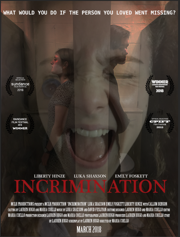
Here we have lowered the tagline at the top because there was too much empty space that we thought looked odd; and we also worked on reviews as we thought this was very important. So rather than creating our own film festivals etc, we decided to research into real film festivals making sure they were suited to our type of film and also suited to our type of audience. Furthermore we researched into independent, British based film festivals, such as 'Sundance, Raindance, CPIFF' and many more; adding these to our poster would intrigue our audience as if the film has been given good reviews people are more likely to want to watch it.
|
Task 25-Creating our Magazine Cover
Magazine Cover Inspiration:
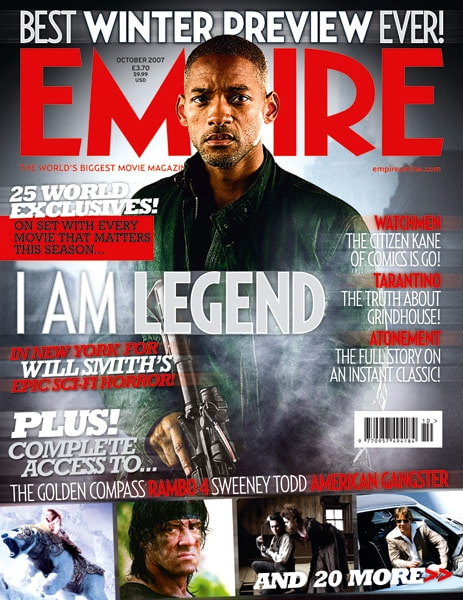
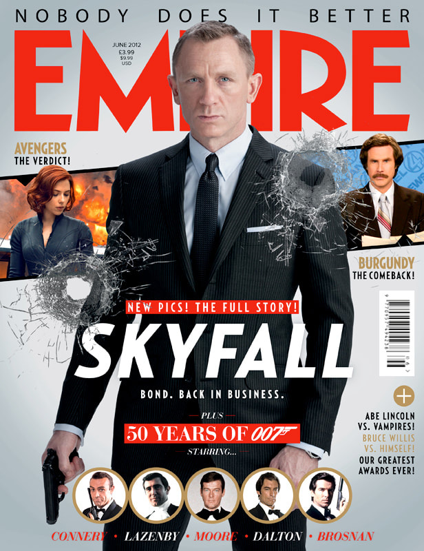
EMPIRE Magazine
|
|
|
'Empire is a British film magazine published monthly by Bauer Consumer Media of Hamburg based Bauer Media Group. From the first issue in July 1989, the magazine was edited by Barry Mcllheney and published by Emap. Bauer purchased Emap Consumer Media in early 2008. It is the highest selling film magazine in the United Kingdom and is also published in the United Sates, Australia, Turkey, Russia, Italy and Portgal. Empire organises the annual Empire Awards which were sponsored by Sony Ericsson , and from 2009 sponsored by Jameson. The awards are voted for by readers of the magazine.'
-Through researching this magazine we found out that the films that they promote are usually mainstream, blockbuster films which doesn't fit our film trailer as ours is a British independent film therefore it would be wrong for our film to be promoted through this magazine as we would be targeting the wrong audience and our target audience wouldn't be shown our product and therefore our film won't get much attention and therefore not much success. This is when we decided it was important we looked into film magazines which would fit our film trailer...
-Through researching this magazine we found out that the films that they promote are usually mainstream, blockbuster films which doesn't fit our film trailer as ours is a British independent film therefore it would be wrong for our film to be promoted through this magazine as we would be targeting the wrong audience and our target audience wouldn't be shown our product and therefore our film won't get much attention and therefore not much success. This is when we decided it was important we looked into film magazines which would fit our film trailer...
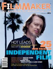
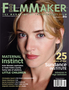
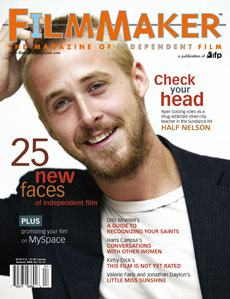
FILMMAKER Magazine
|
|
|
'Filmmaker is a quarterly publication magazine covering issues relating to independent film. The magazine was founded in 1992 by Karol Martesko- Fenster, Scott Macaulay and Holly Willis. The magazine is now published by the IFP (Independent Filmmaker Project), which acts in the independent film community'.
We thought this magazine would be great to use as it is an independent, British film magazine which fits perfectly into our type of film, however neither me or my partner had really heard of it before, and although it would be suited well to promote our film it may not have been the right magazine to promote our film as if it isn't as well known our film won't get much attention.
We thought this magazine would be great to use as it is an independent, British film magazine which fits perfectly into our type of film, however neither me or my partner had really heard of it before, and although it would be suited well to promote our film it may not have been the right magazine to promote our film as if it isn't as well known our film won't get much attention.
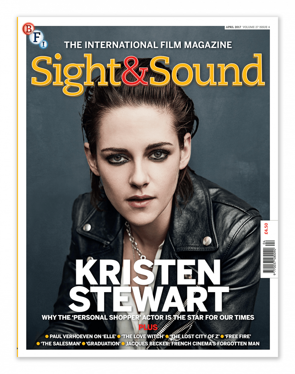
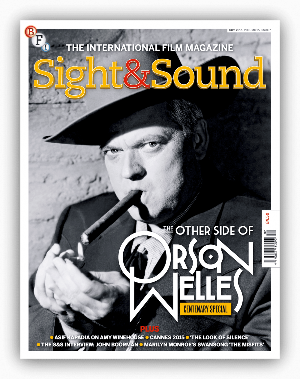
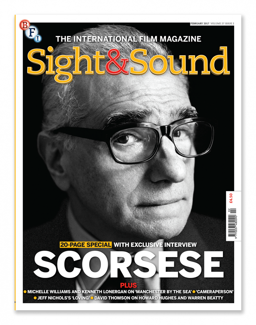
SIGHT & SOUND Magazine
|
|
|
'Sight & Sound is a British monthly film magazine published by the British Film Institute (BFI)'.
This film magazine took our attention immediately as not only is it well known so our film could have the potential to get more attention and therefore more likely to attract a bigger audience; it also is an independent, British film magazine which would be attracting our correct target audience members. The magazine cover also focuses on the actor rather than the character, this intrigued us and made us think that using this magazine would help our audience to get to know our main actor more and therefore would help them connect to the actor more, helping them to get to know a bit more about them and therefore hopefully becoming more invested and perhaps interested in the film.
This film magazine took our attention immediately as not only is it well known so our film could have the potential to get more attention and therefore more likely to attract a bigger audience; it also is an independent, British film magazine which would be attracting our correct target audience members. The magazine cover also focuses on the actor rather than the character, this intrigued us and made us think that using this magazine would help our audience to get to know our main actor more and therefore would help them connect to the actor more, helping them to get to know a bit more about them and therefore hopefully becoming more invested and perhaps interested in the film.
SIGHT & SOUND Mood Board
I decided to create a mood board and decided to analyse it in order for me to get a better understanding of what the 'Sight and Sound' magazine covers do and use to promote their films.

Doing this really helped me understand what type of magazine cover we were promoting our film on and also helped me gain inspiration for what we could do in order to create the best magazine cover we can possible.
Different 'Sight and Sound' logos...
When researching the 'Sight and Sound' magazine we realised that two different styles of the logo were being used and we did further research into this in order to understand why this was done...

|

|
|
This 'Sight and Sound' logo is a lot more contemporary and is used on 'Sight and Sound' magazine covers now a days, you hardly see any other logo on this magazine other than this one used in 2018.
|
This 'Sight and Sound' logo is quite old now and is mostly seen to be used on older 'Sight and Sound' magazine covers. This logo is hardly ever used on their magazines today and from research we believe it isn't used at all any more.
|
From research we decided that it was best to use the logo shown above on the left as it is what is used on their magazines now (2018) and of course it is very important to use the most modern logo we can.
Initial Ideas and shots...
Me and my partner created our own individual ideas for the magazine` and then came together and shared our ideas and explained to each other why we used certain features, we both made the decision to come up with the same number of ideas and then compare them, deciding which ones we thought were the best and perhaps which ones we could use together; using a mixture of both our ideas.

|
|
Our idea for this magazine cover was to show all the characters, we thought this was very important as they are all essential to the story. The location we thought was good to use as it is in school and that is where it is set and therefore this would be setting the scene for the audience, furthermore the positioning of the characters we thought was clever as it represents how Ella's character's mental health is so over-whelming that it has taken over everything including the narrative as the reasoning for the whole plot is because of Ella in the first place. Although we liked this shot we believed it may have been too simple and perhaps the background wasn't the greatest background we could have used as it isn't actually seen that much in the trailer and therefore won't be seen as that significant to the audience.

|
|
Our idea for this magazine cover is similar to the shot we used in our film poster, we really like this shot as it is shot in an essential place (the place that is suggested Alice goes missing in.) We also really like the idea of how the two, what could be called 'enemies' are standing back to back almost like a 'stand off' between the two. Although we are a big fan of the shot we believe it is far too similar to the film poster and also doesn't really fit the conventions of a magazine cover.
|
|
Our idea for this magazine cover was focused on the character Ella, (another idea that was used for an initial idea for the film poster.) We believe this shot works a lot better for a magazine cover as, especially with 'Sight and Sound' magazines close up shots are used and this would be using magazine conventions well. It also shows a vulnerable image of Ella's character which further conveys part of the narrative of the film; however we do believe that if any character is to be shown it should be Alice's character as she is the main focus of the film.
|
|
Above are some shots that were unplanned, these improvised shots were taken when we were experimenting with different shots and angles; we believe that these shots were very creative and gave an overall sense of doom and fear that has been inflicted on the character, this would allow the audience to understand the character of Alice a bit more through her facial expressions.

|
|
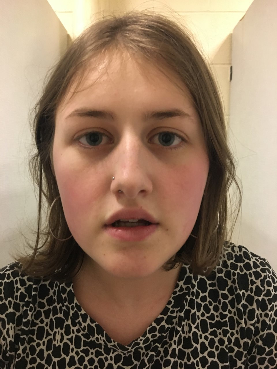
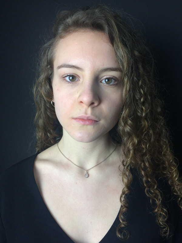
Our idea for this magazine cover was to show the actor who plays Alice rather than the character as this is another convention that 'Sight and Sound' magazine covers use. We believe the shot to be very professional and it to be clear on who it is focusing on (i.e. the actor is recognisable in relation to the trailer and film poster.) We also believe that the pale skin against the dark background makes her really stand out and that the perfect mix of dark lighting and bright lighting on her face gives a sense of 'doom' which links to the narrative well.
Here are other shots we thought about using for our initial ideas however we believed the ones below weren't as clear or effective due to the angles:

|

|
|
|
WE LIMITED OUR IDEAS DOWN TO THREE OF OUR IDEAS WE THOUGHT WERE THE BEST AND WORKED ON ALL OF THEM TO SEE WHICH MAGAZINE COVER WOULD BE MOST EFFECTIVE...
Film Magazine Cover Initial Idea (1)
When creating this magazine I took the shot using a Canon camera, and my partner offered advice on a range of lighting ideas to create the correct atmosphere. When it came to editing we both decided together on the layout and decision of what features should be on the magazine, like the bar-code etc. I made the decision to put the image in a black and white stock and my partner edited the lighting of the picture- changing the exposure.
|
For this shot we decided to change the colour to black and white and also decided to change the exposure a bit in order to make the shot look darker and represent the character's darker side. We also added the red writing at the bottom as it stood out here and was very clear to read which is of course what we want as it needs to be memorable for the audience so it is more likely to stick in their head. However with this magazine poster we had to change a few things, such as the title of the film- it isn't the same as the font in the trailer or on the poster as it just didn't look as good, and the same goes for the 'Sight and Sound' logo, the more contemporary one just didn't really fit with it. This unfortunately meant that it ruined the synergy between the products and due to the logo not being contemporary and up to date it would be unappealing to the audience; therefore we felt like this magazine cover just wouldn't work with our film.
|
Film Magazine Cover Initial Idea (2)
|
For this magazine cover we first decided to (like our poster) take two shots and merge them together of both Alice's character. The use of the merging of the two shots gave it a 'creepy' tone, and it clearly portrayed the character and her status in the film. Another thing we decided to do was change the lighting by putting a darker tone on it which we felt created a more suited atmosphere to the magazine cover; furthermore we also used the more suitable 'Sight and Sound' logo and used the same font and colour of the title which we used on the poster and in the trailer which would create good synergy between the products and would be easily recognisable for promoting the same film. However we did believe that it wasn't suited to the 'Sight and Sound' magazine cover enough as we were focusing on the character more rather than the actor and it just didn't fit or look right.
|
When creating this magazine I took the shots with a Canon camera and my partner offered a range of different poses our character could be in to represent the character's personality. When it came to editing I decided to merge the two images and decided to change the lighting and exposure; and together we decided what specific features should go on the magazine and where they should be placed.
Film Magazine Cover Initial Idea (3):
When creating this magazine cover I took the shot with a Canon camera and both me and my partner directed our actor to stand in certain positions and show specific facial expressions. I decided to have a black background for the shot and my partner used photography lights to help get a better shot and create a certain effect. When it came to editing we both suggested looking at examples of real media and followed similar conventions of a 'Sight and Sound' magazine.
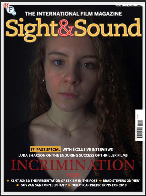
FIRST DRAFT
|
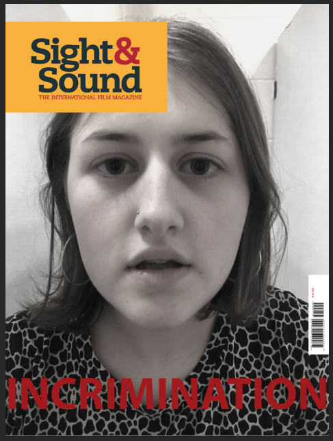
This is our first draft of our film magazine cover that we believe to be quite successful so far in following the conventions of a thriller magazine cover. First of all we are using our own original image which is very professional which focuses on the main character portraying to the audience who the main actor in the film is and how they are the focus of the film. We also believe the shot is very suitable for the 'Sight and Sound' magazine as their magazine covers usually use professional close up shots of their actors to promote their films which is very similar to what we have done. Furthermore we have made sure we have added in essential features such as the date and issue in the right hand corner 'JANUARY 2018 VOLUME 33 ISSUE 1', the 'PUFFS' to main articles at the bottom telling the reader what is inside the magazine, the specific bar code on the right hand side and also the correct size of the different writing on the magazine cover. Another feature we used was the use of the dark lighting and also the slight red tint used on her face which is what we used in the film poster- this creates synergy well as it is clear they are linked. Another technique we used which also uses synergy well is the title 'Incrimination' using the same colour, font and size that is used in the trailer and poster.
|
|
We decided to change the angle and shot of the picture of Luka Shaxson as the original picture we were going to use was too close and most 'Sight and Sound' magazines have their subjects in the pictures slightly further away so that the 'Sight and Sound' goes behind the subject's head but is still visible.
|
We experimented changing the style of the magazine cover by changing the effect and colour- and although we really liked the effect we thought it was too far-fetched from our film and it wouldn't have been recognised for promoting the same film.

|
SECOND DRAFT
For this draft we both made the decision to have the actor in front of the magazine title as she is easily seen and there is more emphasise on her as an actor.
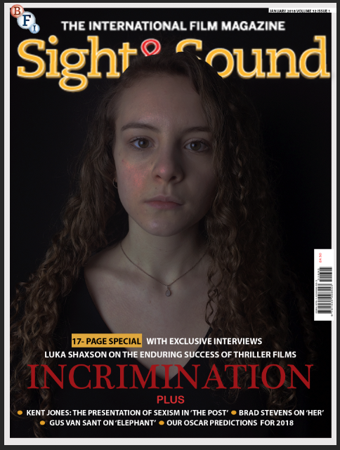
The main thing we have edited here is the layering, so that Luka Shaxson is in front of the title so that she stands out and also the editing of the colouring and exposure on the picture, to make it look darker and dingier in order to represent the film and narrative.
Task 26- Analysing target audience feedback on the first draft of our ancillary products
From our previous target audience research we discovered that one on one interviews and also online questions/questionnaires were the best way in order to get more accurate and beneficial feedback in order to improve our products. This is why we decided to ask some of our target audience members questions about our first drafts of our magazine cover and film poster for our trailer and filmed their reactions to our products...
Social Media Responses
We also decided to get feedback through the social media site- 'Snapchat', we believed we would get more accurate feedback through 'Snapchat' as it is a social media site which is very popular amongst teenagers and young adults, which is our target audience.

|

|

|
'Snapchat' Feedback:


From all of our overall feedback I believe the main things we need to work on is making sure that both the magazine cover and poster look like they are promoting the same film, because although a lot of the people we interviewed and asked questions to said they thought they were promoting the same film, the majority of them still said it could be made even more obvious so that you would know straight away. Another thing we learnt from this research was that we need to work on the colours and effects used on the magazine to portray the genre and mood more like we have done with the poster. We also learnt that our target audience particularly liked our poster in general because of the effect the merging of the two images gave and also the use of colours; we also learnt that they liked the photography used on the magazine as they thought it was very professional . We will use all the feedback given in order to help us improve our products in order to satisfy our target audience and create the best poster and magazine cover we can possible.
Task 27- Creating Synergy
Drafts of Trailer...
|
SECOND DRAFT
In this draft we have added footage of the character Millie looking at pictures of the character Alice on a social media site- we did this to add more empathise to their relationship and highlight her envy even more. Furthermore we also added a voice over of a news report saying that Alice has gone missing to make the narrative even clearer.`
|
THIRD DRAFT
In this draft we changed the text at the end when the following sentence is written 'WHAT WOULD YOU DO IF THE PERSON YOU LOVED WENT MISSING?', the reason we did this was to create more synergy between all products, the text at the end is the same text that is used on the poster where the same question is shown. This would allow the audience to recognise the two media texts as promoting the same film.
|
Our FINAL Products:
All final decisions were made together (were both mine and my partners ideas.)
FINAL Trailer Draft
FINAL Poster Draft

FINAL Magazine Draft

Above are our final drafts for all of our products where we used similar conventions in order to create synergy between them in order for them to be recognised for promoting the same film, this is very important as having the media texts clearly showing that they are promoting the same film will help promote our film in a positive way as not only will we possibly gain a larger audience as we are targeting our audience through different texts but also it will come across as professional and appealing to our audience.
As explained in the video above there were many features in our products that created synergy- however I believe the most effect features that created synergy in our product was the cinematography and actor used throughout the three products of our magazine, poster and trailer as not only did it clearly highlight who the main character was representing her importance within the story line but it also allowed the audience to develop their understanding of her character which would help them engage in the narrative more.
|
|
|
|
|
|
|
 RSS Feed
